Velocity Chart
The Velocity Chart is a graph used in agile project management that shows the amount of work completed by a team in each sprint. It helps predict the team’s capacity to complete future tasks and improve planning. The chart compares the PBIs assigned at the start of the sprint with those actually completed, allowing you to visualize the team’s efficiency and consistency over time.
How to create a Velocity Chart in DoneTonic
First, you need to ensure that there is at least one closed sprint for the chart to display data. This means the review (completion) date of the sprint has already passed.
To create the chart, go to the Scrum Boards section and select Add Chart > Velocity Chart.
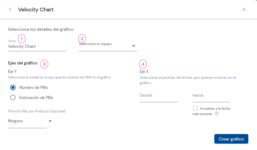
- Name the chart.
- Select the team whose velocity you want to evaluate.
- Y-AXIS: Here you will see the assigned PBIs in a sprint vs. the completed PBIs.
Choose whether you want to view these PBIs by unit, estimation (story points), or dedication (hours logged to complete the PBI).
- X-AXIS: Select a date range.
If you want the chart to update continuously, check the box to update to the most recent date.
Sprints will be shown within the selected date range as long as the review (completion) date of each sprint falls within this range. For example, if a sprint’s completion date is after the end date of the selected period, it will not be shown in the chart.
To edit the chart, simply click on the more options button located at the top right.
Interpreting the Velocity Chart:
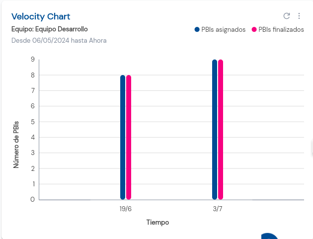
On the Y-axis, you will see the chosen unit of PBIs (Estimation or Number of PBIs), while the X-axis will show the time period and its corresponding sprints.
For example, this chart shows that the Development Team is completing all the assigned PBIs in each sprint. This indicates good team velocity and accurate forecasting. If the bar for completed PBIs is lower than the bar for assigned PBIs, it suggests a problem, as it means the assigned work exceeds the team’s velocity.