Agile Metrics
In Scrum, agile metrics are tools used to evaluate team performance and process effectiveness. These metrics help teams gain a better understanding of their progress and identify issues for timely resolution. Among the most well-known metrics is the Burndown Chart.
The Burndown Chart is a useful visual tool for tracking work progress over time, helping you estimate the completion date of your projects and providing insights into team performance.
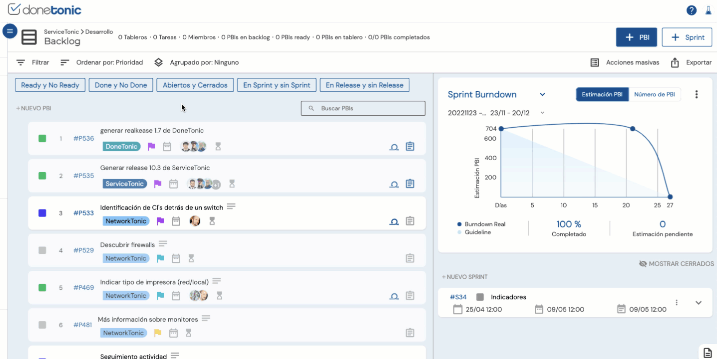
Now, in the backlog of your projects, you can visualize three types of Burndown Charts:
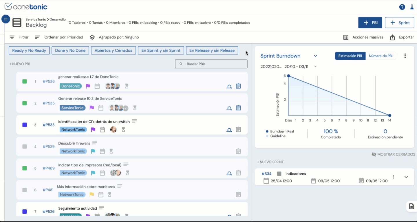
1.Sprint Burndown Chart:
The objective of the Sprint Burndown is to ensure that all forecasted work is completed by the end of the sprint and is a key metric for project control and direction.
How to interpret the Sprint Burndown Chart?
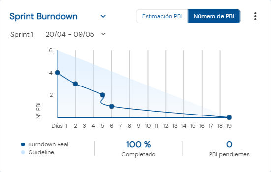
- The X-axis represents the days that make up the Sprint. Typically in Scrum, they are often 14 days, but there are occasions when sprints last longer.
- The Y-axis represents the amount of work to be done during the sprint. In Done Tonic, this can be calculated either by the Number of PBIs (Product Backlog Items) or the PBI Estimation.
- The blue line of the actual Burndown represents how the team is progressing and the total amount of work remaining in the sprint, based on estimates or the number of PBIs. It will be updated with each completed PBI.
- The Guideline or Guide Line is an estimate of where the team should be assuming linear progress. It will serve as a guide to determine if we are progressing properly or if we are encountering issues along the way.
Note:
If the blue line is below the guideline, it means that the team is progressing faster than expected and is likely to finish the work on time. If the blue line is above the guideline, it means that the team is taking longer than expected to complete the tasks.
But please note that this is not a guarantee; it’s simply a useful tool for monitoring team progress.
Do you want to know how Sprint Burndown metrics are calculated in Done Tonic?
DoneTonic updates the Sprint Burndown chart by considering the numbers of closed PBIs (Product Backlog Items) or PBI estimations by date. This is why it’s important to keep your sprint board updated so you can monitor the sprint’s progress accurately.
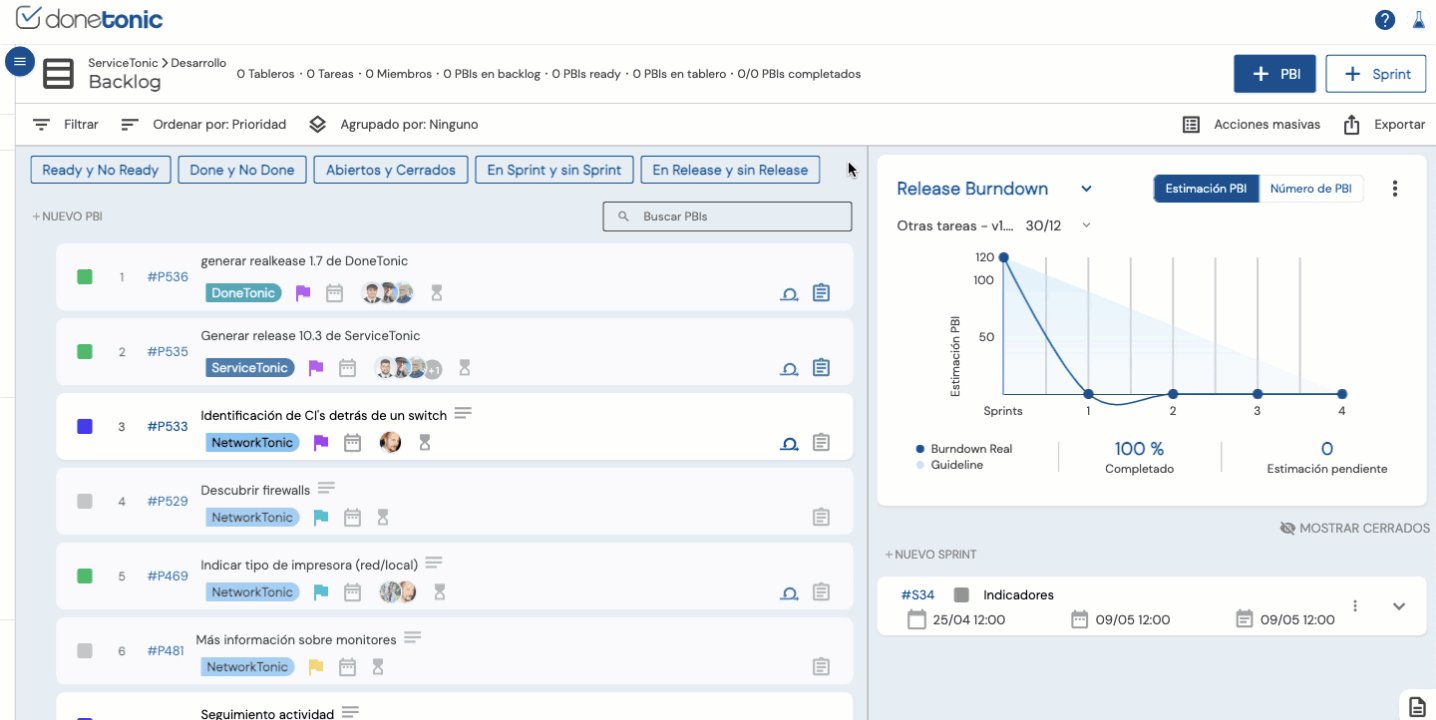
2. Release Burndown Chart:
In the case of the Release Burndown, it monitors the progress of a larger amount of work than the Sprint Burndown since it calculates the amount of pending work for the next release.
Since a sprint can contain PBIs from different releases, it’s important to monitor both the progress of individual sprints and the releases.
You can view the Release Burndown Chart by clicking on the dropdown menu of the Burndown:
How to interpret the Release Burndown chart?
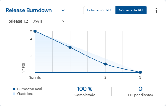
- The X-axis in this case represents the sprints that are part of the release.
- The Y-axis represents the amount of work remaining to complete the release. Similar to the Sprint Burndown chart, this can be visualized using both the Number of PBIs and PBI Estimation.
- The blue line of the actual Burndown represents the progress line indicating how the team is progressing.
- The Guideline or Guide Line, like in the Sprint Burndown, serves as a guide, providing an estimate of where the team should be.
How does Done Tonic calculate these metrics?
In this case, DoneTonic analyzes not only the numbers or estimations of PBIs in the DONE state but also takes into account which sprints each of these PBIs belongs to. As mentioned earlier, it’s important to keep the sprint and PBI statuses updated to correctly visualize this graph.
3. Backlog Burndown Chart:
The primary objective of the Backlog Burndown is to show how much work is left in the backlog of a product/project and how the team is progressing towards completing that work. This helps the team stay focused and on the right track to meet the set objectives and deadlines. If the chart indicates that the team is not progressing fast enough, they can take steps to adjust their process.
How to interpret a Backlog Burndown Chart?
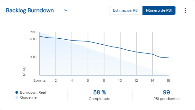
- The X-axis in this case represents all the sprints of your project.
- The Y-axis represents the amount of work remaining in the backlog. Similar to the Release and Sprint Burndown, it can be calculated using both the Number of PBIs and PBI Estimation.
- The blue line of the actual Burndown represents how the team is progressing and the total amount of remaining work in the backlog according to estimates or the number of PBIs.
- The Guideline or Guide Line, like in all Burndown charts, serves as a guide, providing an estimate of where the team should be according to the set deadlines.
It’s crucial to keep in mind that the Backlog Burndown will continue to grow as you add more items to your backlog, unless you have already planned all the PBIs for a project in advance.
Options for Viewing the Burndown Chart:
In Done Tonic’s Burndown charts, you can visualize your workload by both the number of PBIs and the estimation of PBIs. In the latter case, please note that all PBIs must have their estimation calculated in advance for proper visualization.
To select the type of visualization you prefer to see in your graphs, simply click here:
If you wish, you can press the ‘save view’ button, and you’ll always be able to view the data in your preferred way.
Search Options in the Burndown Chart:
Do you have a large number of sprints or releases generated and find it difficult to locate the Burndown chart you need? Don’t worry, we’ve made things easier for you. Simply use the search bar in the Burndown chart to quickly find the sprint or release you want to visualize:
Otros artículos de interés: